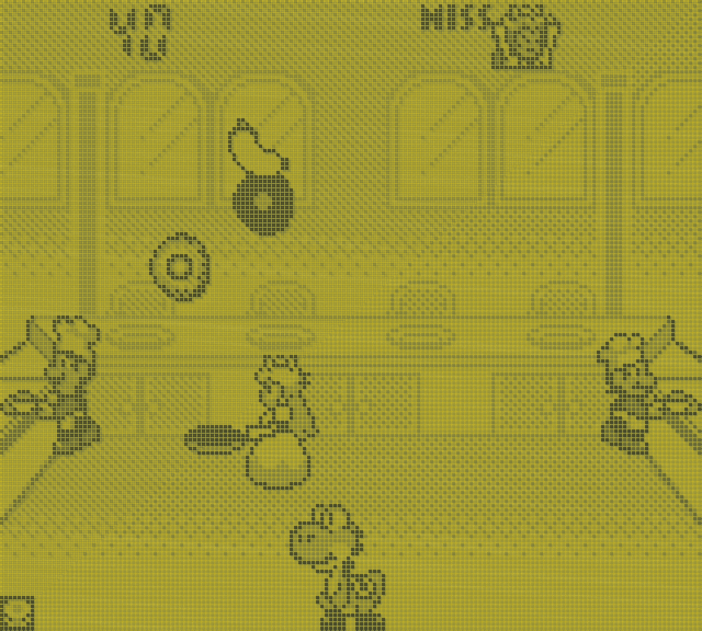
I am *really* impressed with how the artists tackled this situation. This is from Game and Watch Gallery 2 for GB and GBC. In GBC mode, it uses color to indicate how well done the food is, but in GB mode there's obviously not enough colors to do that, so instead they use shading: white means undercooked, black means overcooked, shaded means just right.
And then! They also drew a _background_ for this!
"Aren't you already using all four colors for the food?"
"It's fine, we'll just put a black outline around every foreground object, and then draw a background that doesn't use any black."
Genius.


 :
: 


 Capcom
 1994
1994 New Nintendo 3DS, SNES, Wii U